Contact
‘Sup
Clients
Portfolio
About
Home
Loan Origent  •  Loan Origent  •  Loan Origent

TURNING ORBITAL SCIENCE INTO DIGITAL PRESENCE

Predicting devastating wildfires from space is a groundbreaking concept, but securing venture capital requires a story that resonates on the ground. I was brought in to translate Earth Fire Alliance’s orbital technology into an investor-facing website and narrative. But reaching liftoff required a last minute pivot.
3 people icon
Client: Earth Fire Alliance
3 rectangular shapes
Project Type: Website
1 person with 4 curved lines surrounding
My Role: UX, UI, Dev.
Desktop web design showcasing key project milestones and impact metrics using a clean, modern aesthetic with space-themed orbital imagery.

CHALLENGE AND RESULTS

Making global wildfire tech approachable
When the chief points, they need to know exactly where they’re headed. EFA’s satellites deliver that clarity, piercing dense smoke across five wavelengths of light to track a fire’s size, heat, and path. Working with the managing director and head of global branding the challenge was clear. It was now a matter of translating that tech into compelling web design, and capital. Rather than burying the lead, let’s start exactly where this project succeeded: the business outcomes.
Satellite with extended solar panels and a gold-colored component at the base.
Side view of a firefighter in black gear and helmet numbered 3, looking intently forward and pointing.
Translated complexity into clarity
Expert research posits users read only ~20–28% of text on a page. To ensure the site landed, I balanced deep technical information with strategic visual design, relying on scannability, hierarchy, and concise writing to guide the reader.
End-to-end product ownership
By handling the Figma-to-Webflow build and using LLMs for complex code, I operated as an autonomous team. Leadership called my delivery “a breath of fresh air” when “the last thing we needed was another contractor to manage.”
Secured early market traction
The final launch earned high praise, but more importantly, it immediately executed its core business mission. The fully responsive site successfully supported their pitch, attracting a growing list of early adopters.

GET A PEEK HERE. SEE THE REST THERE.

Zooming in on the hero section
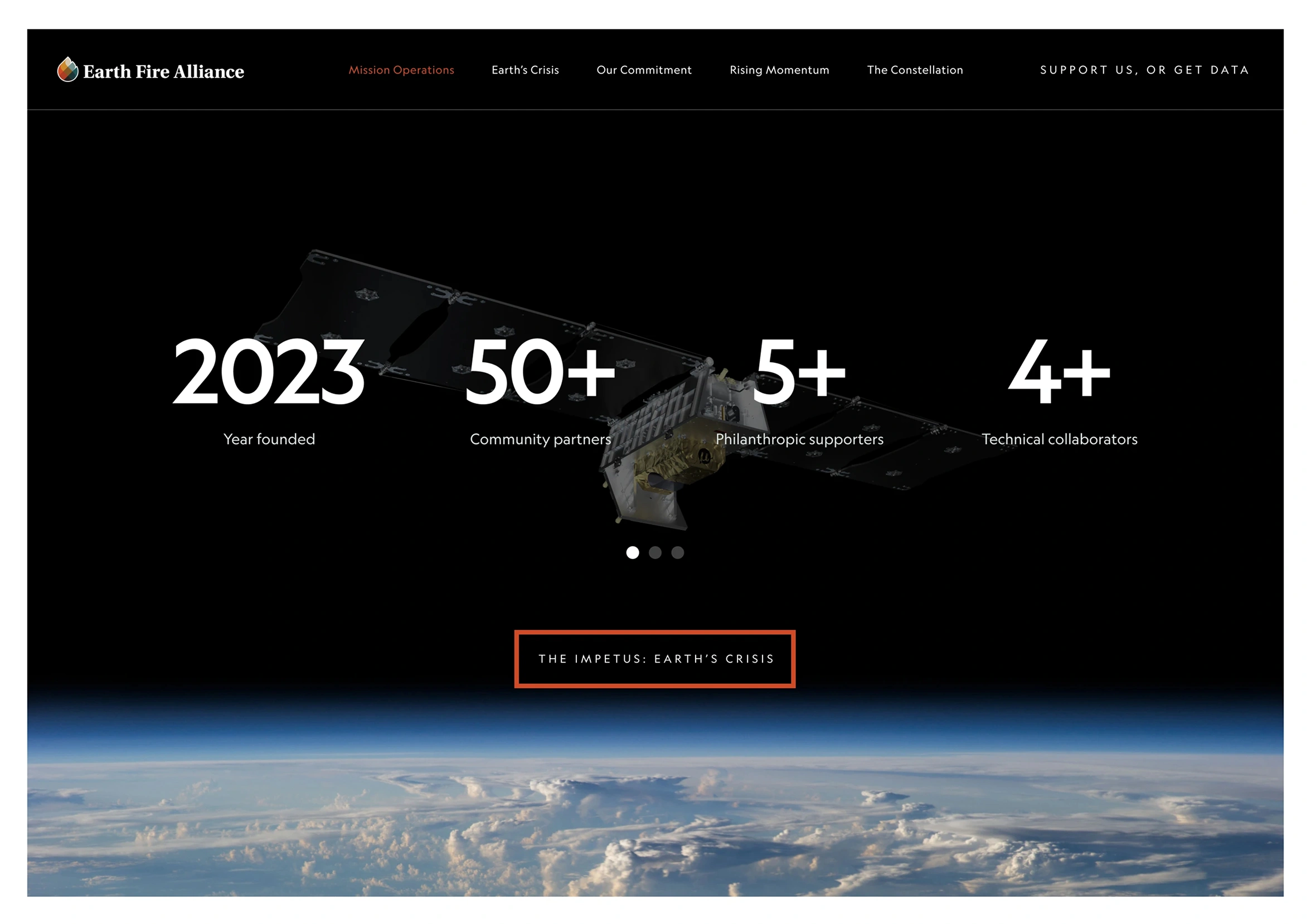
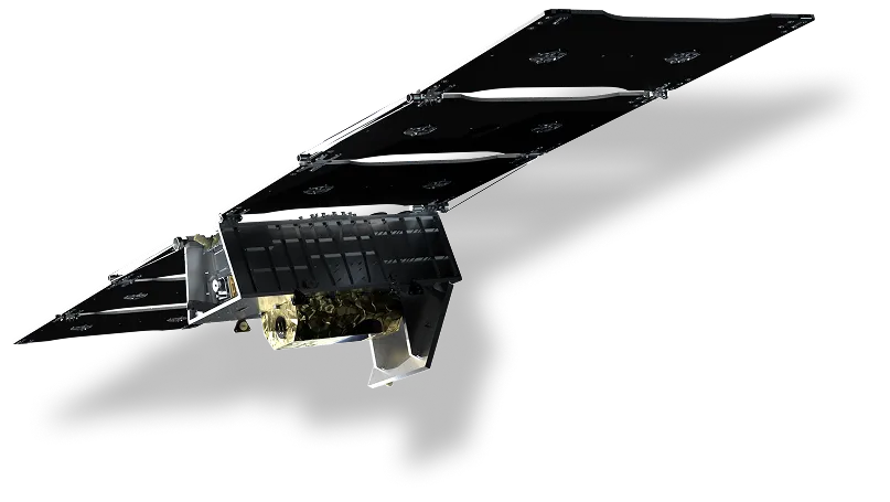
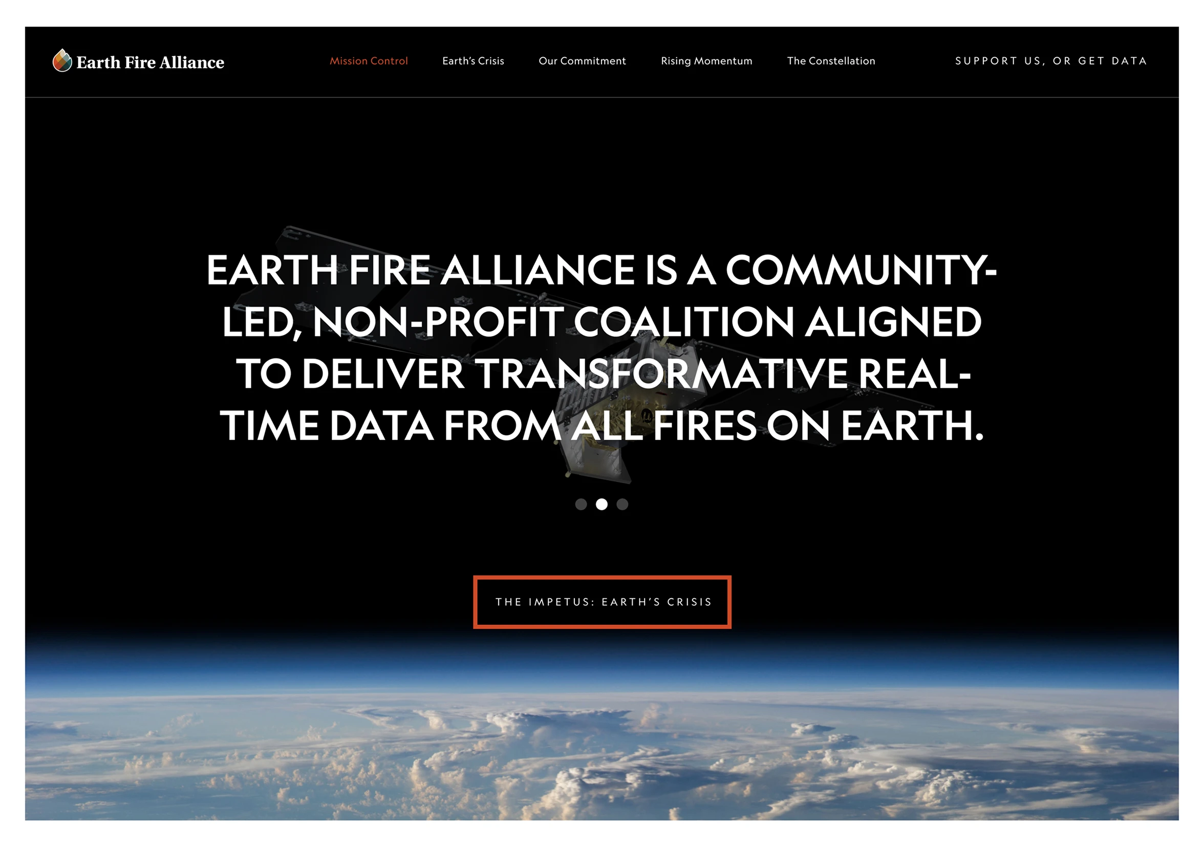
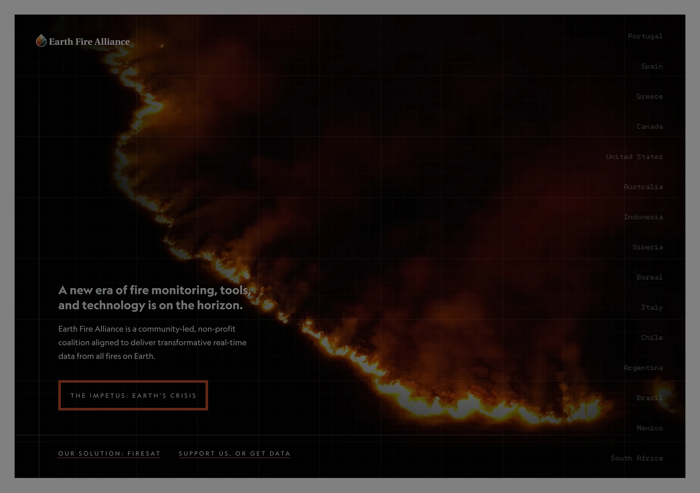
The hero section balances showcasing the actual satellite with highlighting key social proof (like their technical collaborators and supporters) and articulating EFA’s core mission. A sleek, high-tech aesthetic to mirror their orbital offering felt most appropriate. We locked it in. But for reasons entirely beyond our control, this wouldn’t be the design we released to the world.
High-fidelity web design featuring bold typography and mission-driven copy overlaid on satellite imagery, emphasizing brand identity and technical authority.
Desktop: A look at the original desktop UI right before our unexpected pivot.
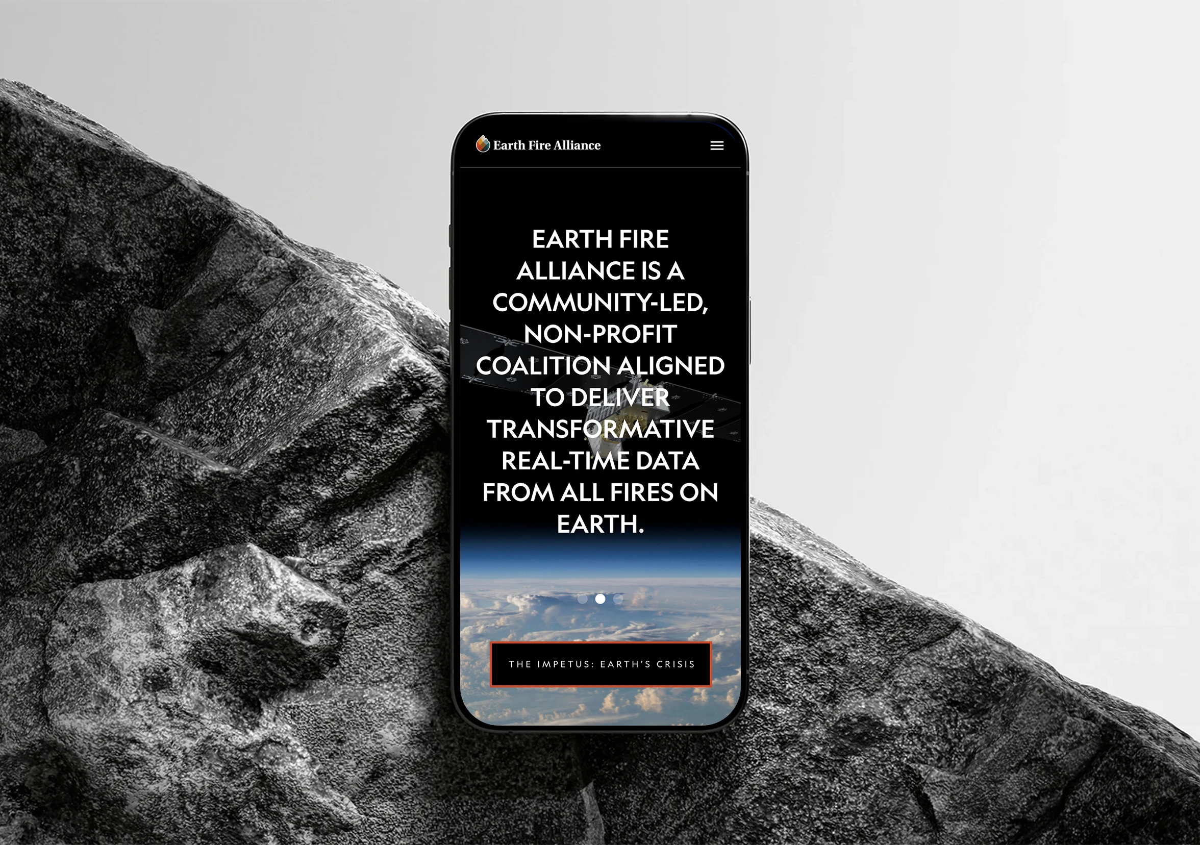
Responsive: How the original UI components reflowed across mobile breakpoints.

RAPID ITERATION TO EXTENGUISH A FIRE OF OUR OWN

Wildfire burning dry forest floor and tree branches with smoke in the background.

Wildfires Change Direction. So Did We.

Stakeholders were thrilled and we were ready to go live until the ground shifted. A competitor unexpectedly launched a refresh with a hero section that looked nearly identical to ours. Launching a design that appeared derivative was simply not an option for a brand meant to turn heads. To protect the project’s integrity, I immediately pivoted to find a fresh visual direction that felt unique.
I rapidly prototyped a new strategy, isolating the structural changes to the hero section while ensuring the shift remained mission-critical. The client loved this revised version even more than the first. Because web design is public-facing rather than hidden behind logins, the impact is best experienced firsthand. You can explore the final handoff or the original concept via the links below.

VIEW THE SCRUBBED DESIGN

Case Study

Up Next

B2C