Contact
‘Sup
Clients
Portfolio
About
Home
Loan Origent  •  Loan Origent  •  Loan Origent

DRIVING PRODUCT VISION FOR A FINANCIAL CRM

Late in the evening, a buyer wonders if homeownership is even within reach, while a loan officer struggles with a legacy CRM. I was contracted to bridge that gap by reimagining their white-label platform. I delivered a high-fidelity prototype and the experiential blueprint required to secure phase 2 buy-in.
3 people icon
Client: Loan Origent
3 rectangular shapes
Project Type: Web App
1 person with 4 curved lines surrounding
My Role: UX, UI
Mobile UI design of a Loan Officer dashboard featuring performance metrics, data visualization for active loans, and a bottom navigation bar for a financial CRM.
Detailed user profile view in a mobile CRM, showing a tabbed interface for applications and tasks, emphasizing information architecture and visual hierarchy.
A clean mobile UI for inviting new borrowers. It features a simplified form for contact details and an editable template for personalized home loan invitations.

CHALLENGE AND RESULTS

Closing the gap to homeownership
We set out to help borrowers move through the loan process faster, aiming to slash application time from [redacted] minutes and push submission rates past [redacted]%. On the loan officer side, the goal was to help them complete tasks more efficiently. Measuring the success of a prototype is often qualitative, but I leaned on industry best practices to ensure these improvements were strategically viable.
Two silver metal house keys on a keyring casting a shadow on a white background.
Smiling woman in white blouse talking on phone while using a laptop in a modern office.
Maximized design ROI
Revamped dual sided interfaces and interactions surface actionable data for officers, and clear next steps for borrowers. Per industry benchmarks this projects a 107% design ROI increase.
Accelerated loan conversion
Redesigned the intake flow to keep borrowers in platform by integrating native tools for immediate answers. Reducing this friction leverages UX principles that boost conversion up to 120%.
Derisked product lifecycle
An acute awareness of the $1 to $100 metric reinforced thoughtful decisions that protected engineering and design budgets to successfully lay the foundation for phase 2.

LOAN ORIGENT’S UNIQUE SELLING PROPOSITION

The dual-sided challenge
Loan Origent is a white-label engine designed to facilitate high-stakes loan operations. As a dual-sided platform, it must simultaneously serve the institution originating the loan and the individual borrowing the capital. To hit our KPIs, the objective was twofold: redesign the officer portal to prioritize high-frequency metrics and urgent interactions, while ensuring borrowers gained a clear, intuitive map of their progress through the pipeline.
Desktop UI for a borrower closing milestone, featuring a responsive bento-style card layout with educational resources and homeowner support services.
Smiling couple dancing joyfully together in a bright kitchen.

due diligence and competitive analysis

I started by analyzing ~6 hours of stakeholder interviews. From WCAG and ADA compliance to consumer protection and fair lending laws, there were many legal requirements and perspectives to recognize. I noted these from the outset. And while this would become the next product iteration, it was important to recognize these constraints from the beginning to make sure we were headed in the right direction.
In this work I documented every detail, pinpointing where stakeholder priorities overlapped or conflicted. I then conducted a competitive analysis, scouring industry blogs, app store screenshots, and other sources of information to glean leverage-able insights. I’ll skip showing you the requisite wall of sticky notes. Just know that the thinking happened and it was rigorous.
Video call grid showing nine animated avatars with names and roles, including CEO, Project Manager, Engineer, Sales, Legal, Compliance, Product, Client, and Product Design.

Enhancing the loan officer user experience

With UX now established, this series of redesigned screens gives a bird’s-eye view of the loan officer interface. The dashboard features filterable, customizable, and action-oriented interactions. Unlike before, when loan officers log in to the platform, they can immediately see a scorecard of high-priority actions they may want to act on, such as the number of people who’ve applied for loans and those who were recently active.
Internal systems, especially legacy ones, often force users into predefined workflows. To break out of that format, most screens are customizable. In addition to freeform search, the loan Pipeline screen gives users the ability to tailor their feed with the specific data points they’re most interested in. Further, the loan pipeline provides quick access to each individual loan, as seen in the last screenshot.
Mobile UI design of a Loan Officer dashboard featuring performance metrics, data visualization for active loans, and a bottom navigation bar for a financial CRM.
Mobile UI for a loan pipeline, showcasing list-based information architecture with search filtering, status indicators, and borrower lead tracking for a CRM.
Detailed user profile view in a mobile CRM, showing a tabbed interface for applications and tasks, emphasizing information architecture and visual hierarchy.

design debt expunged

When designing for different skill sets, I focus on balancing depth with speed. Below, when an officer creates a task for a borrower, they can fill in the complex details once and save it as a template. This turns a potentially arduous data-entry chore into a reusable asset that streamlines the entire workflow.
Mobile view of a borrower's specific task list, demonstrating clear visual hierarchy and status icons to prioritize document collection and action items.
Borrower tasks
This screen highlights a particular borrower’s profile, application, tasks, and more. The tasks shown reflect those an officer has created for the borrower to fulfill.
High-fidelity form design for creating a new task, featuring logical grouping, drop-down menus, date pickers, and a rich text description field for clarity.
Simplifying task creation
Rethinking this flow, task creation is often similar from loan to loan. This approach enables officers to create and reuse tasks as templates.
UI design for a task creation flow in a financial CRM, featuring rich text editing, user assignment with avatars, and document upload categorization for borrowers.
Simplifying task creation (continued)
Further, I added helpful features such as a description formatting bar, avatars for quick visual task assignment, and collapsible panels.

IMPROVING THE BORROWER EXPERIENCE

Two-story modern house with gray siding, white trim, bay window, and a three-car garage at dusk.

The KPIs to the Kingdom

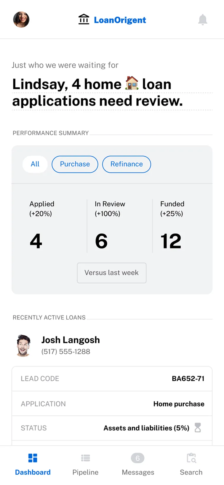
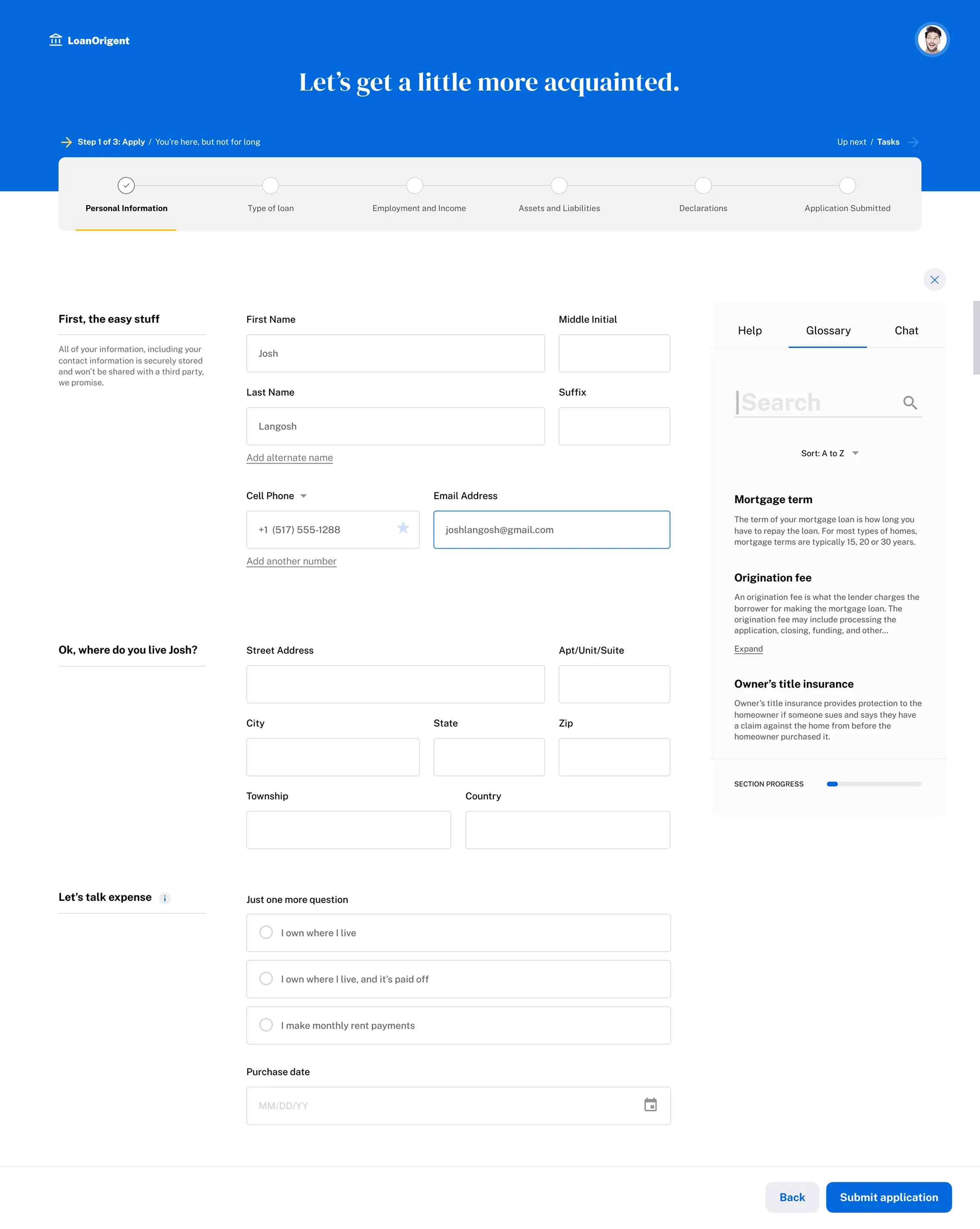
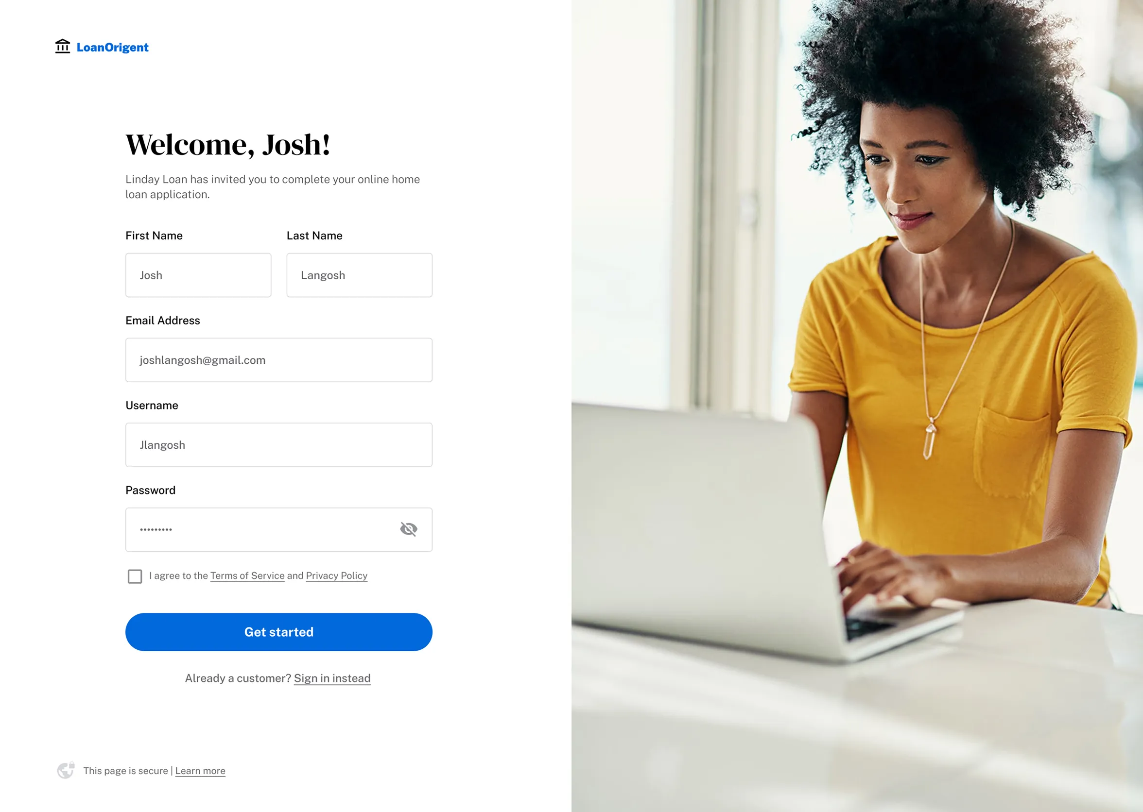
Solving for key performance indicators such as reduced application time and improved submission rates was part and parcel of this work. I prioritized ensuring borrowers knew where they were in the loan process and could recover quickly if they got stuck. That required improving the intake form, from the number of steps to how those steps were presented.
A pithy progress bar to visibly indicate where users are in the process and what comes next was poured over and redesigned. Then, to help users understand what was required of them, helpful additional information flanked each screen. In the right sidebar I created a series of self-service modules that allow space for terms and definitions, FAQs and a chat feature.
Desktop UI of a multi-step mortgage application featuring a stepper progress bar, accessible form fields, and an integrated sidebar glossary for user support.
Detail: Borrower intake form with improved global progress and self-service interactions.

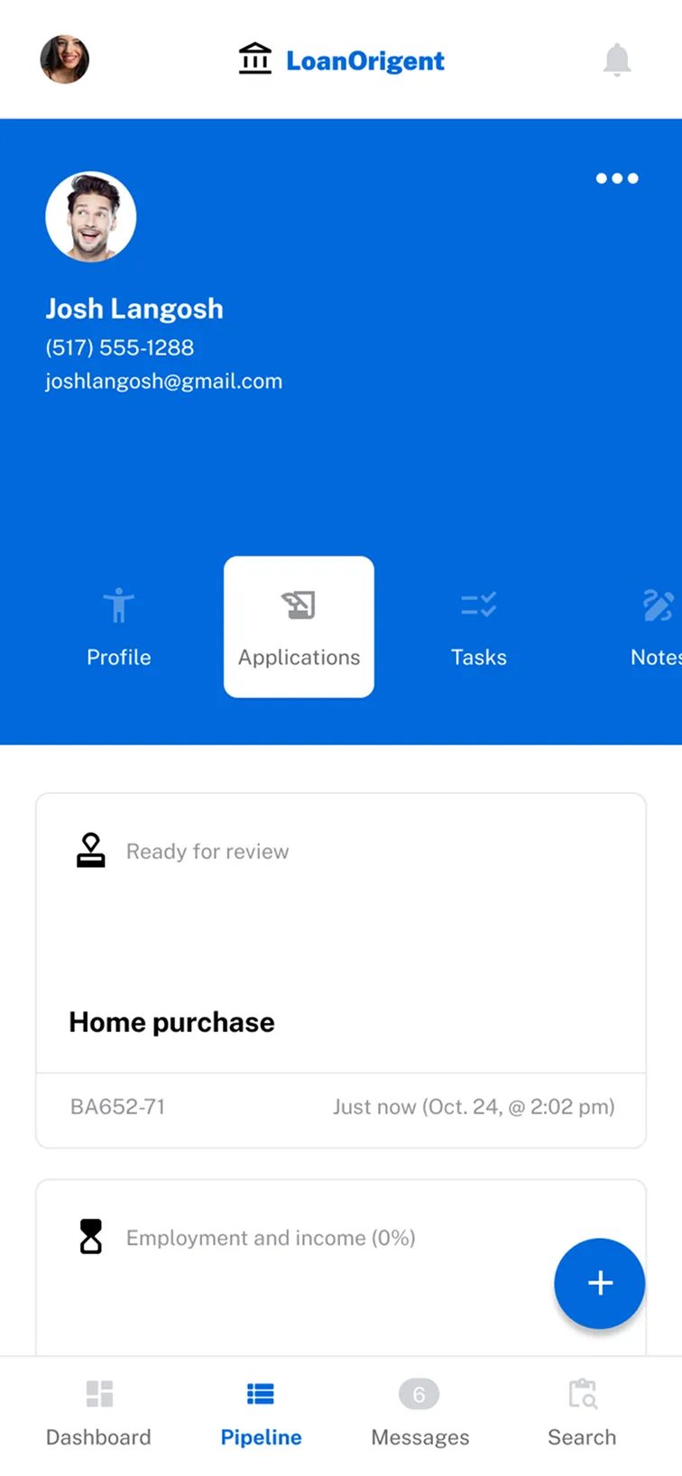
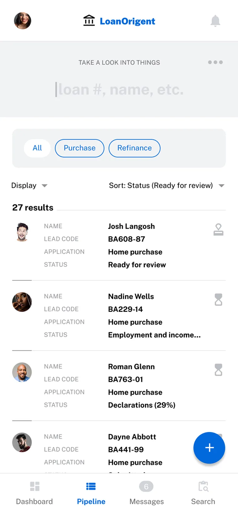
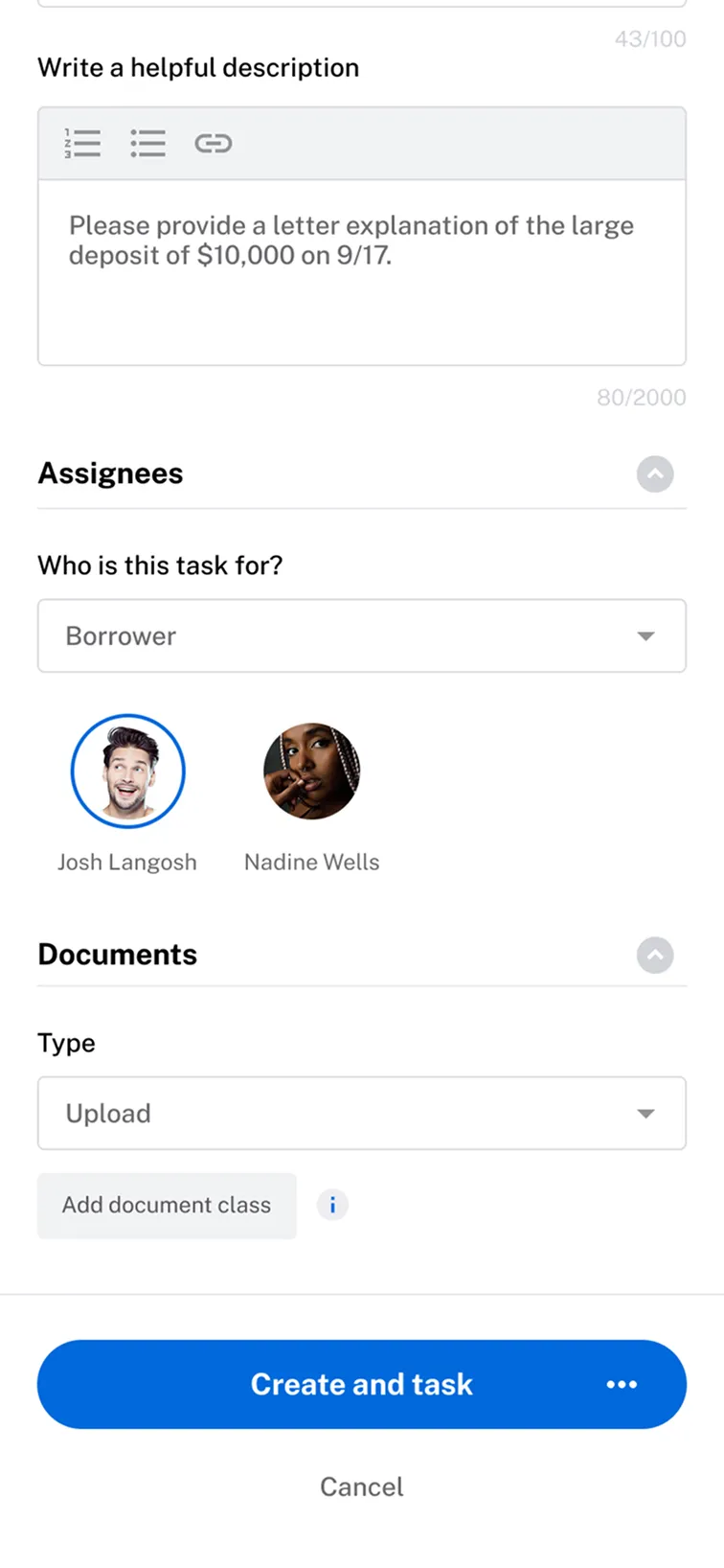
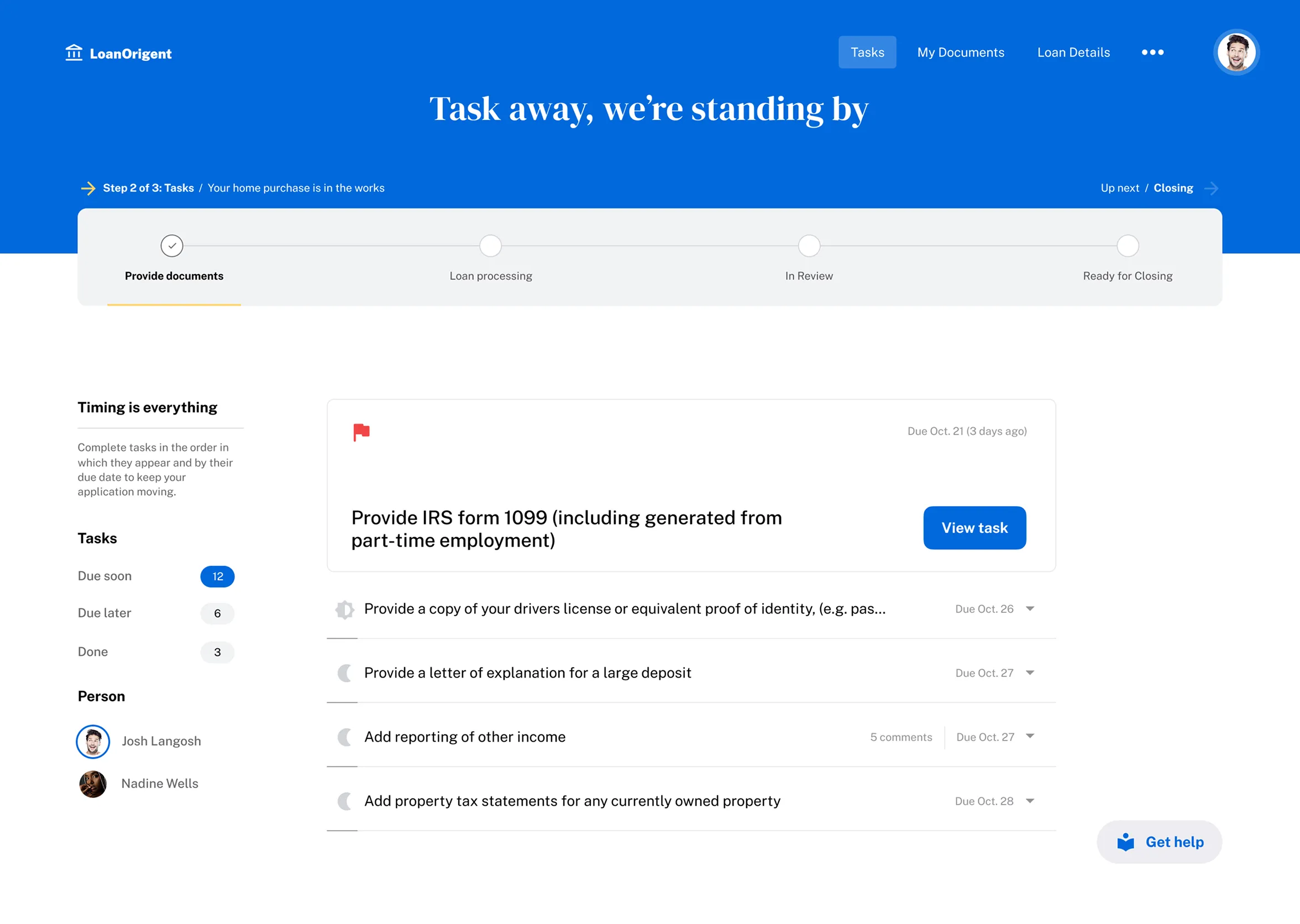
Anatomy of a Task Driven Borrower Experience

As we saw in the officer portal, tasks flow directly to the borrower here. Mortgages require a specific sequence of events, so I prioritized the hierarchy to signal which tasks were urgent. This is designed to reduce cognitive load during what is usually a high-stress financial event.

Helper text in the left column paired with lightweight filters shows the user exactly what’s left on their plate. On the right, I gave the next step the most visual real estate, while using a more compact view for subsequent tasks to avoid overwhelming the user.
Bright green flag waving with visible fabric texture on a shadowed background.
A borrower-facing task dashboard showing a list of required mortgage documents, categorized by urgency with status indicators and a progress stepper header.
Detail: Strategic hierarchy and clear next steps reduce cognitive load for borrowers.

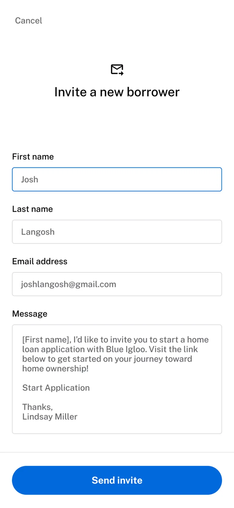
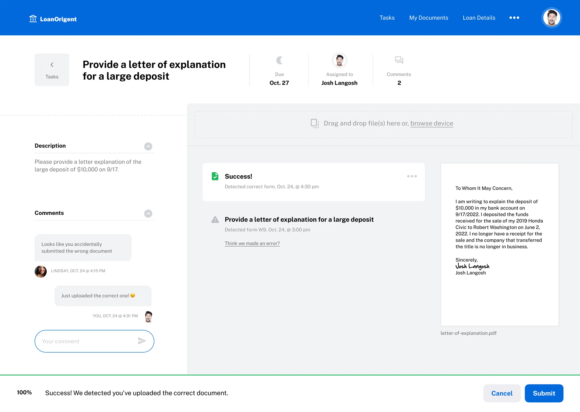
CLOSING THE COMMUNICATION LOOP

Tasks don't exist in a vacuum. To help borrowers reach the closing table, I integrated native communication tools directly into the workflow. I introduced asynchronous, chat-style features for precise communication. Document uploads now include clear activity transcripts, metadata, and live previews. It was a tightrope walk between utility and system integrity. Finally, I designed a resource center for users with their loan in hand, giving borrowers a reason to consistently return.
Desktop interface for document management, featuring a split-screen view with a chat sidebar for real-time collaboration and a PDF viewer for document verification.
Detail: Improved UX and UI, introducing asynchronous iMessage-style communications, and refined document upload and status visualizations.
Desktop UI for a borrower closing milestone, featuring a responsive bento-style card layout with educational resources and homeowner support services.
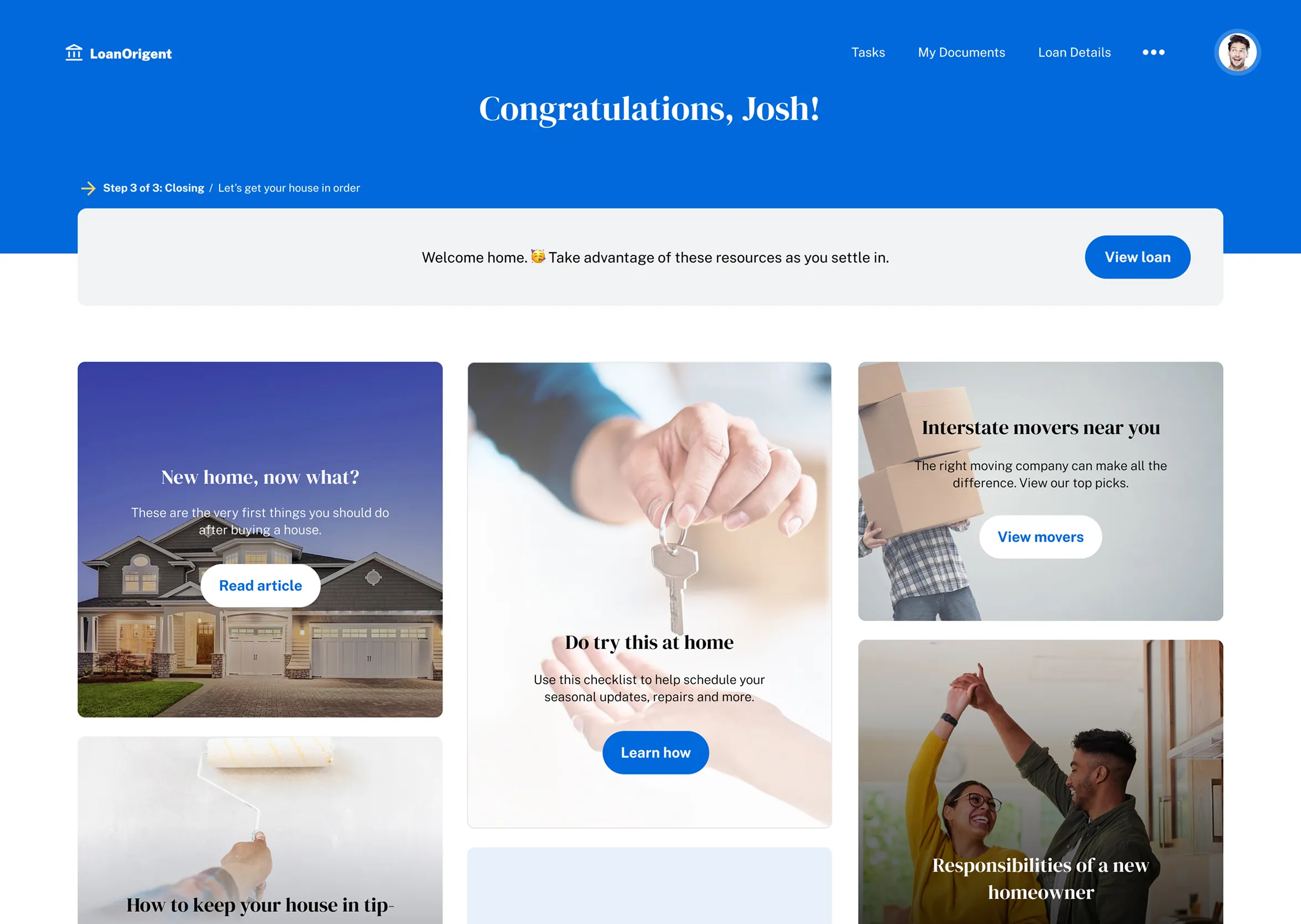
Detail: Loan in hand, I designed a place for additional resources to keep borrowers coming back.

DESIGN ON A DIME

Insights, outcomes, and phase 2 foundations
This work served as the catalyst for a phased platform evolution. By blending agile and waterfall methodologies, I delivered a high-fidelity prototype met with positive stakeholder feedback, structured specifically for an efficient rollout. Upon handoff, engineering began integrating quick wins like the redesigned login experience (shown below), while the more complex task architecture was documented to serve as a roadmap for future implementation.
Two US dimes showing the profile of President Roosevelt and the torch with olive branch and oak branch on the reverse side.
A clean web sign-up page design featuring a split-screen layout with a high-quality lifestyle image and a focused, accessible account registration form.
Login screen: Redesign of login screen. Strategic quick win delivered to engineering for immediate implementation.

HIGH FIDELITY PROTOTYPE

Case Study

Up Next

B2B